

|
IllustrationOVERVIEWTitle: Mirrored Centennial
Size (cm): 38.2 x 25.4 Medium: Gouache paint and ink pen on illustration board Date of Completion: November 2023 EXHIBITION TEXTThe intention of Mirrored Centennial was to create two contrasting versions of Georges Barbier's Falbalas et Fanfreluches, specifically the 1925 publication, to showcase how romantic interactions can be both timeless and develop with society, especially with women's rights. The first drawing imitates Barbier's piece with two men and a woman, and the opposing drawing is two women and a man, both illustrations displaying modern clothing and furniture. Gouache, ink pen and illustration board were used to create this piece.
|
Inspiration

|
Originally I had a completely different concept for this illustration involving technology, but after discovering the work of George Barbier I reimagined my pieces. George Barbier was a French artist known for designing theater and ballet costumes, illustrating books, and creating haute coture, or high end fashion illustrations. His work appeared in magazines and fashion almanacs, as well as other publications. Barbier's style most closely aligns with the Art Deco movement, which rose after World War I and was a response to the organic and curvilinear lines of Art Noveau. Art Deco is characterized by machine age streamlining, vibrant colors, sleek figures, and shiny surface elements. It was meant to reflect and appreciate the modern technology and innovations of the time, which connects well to my assignment to depict modernity in 2023, similarly to how Barbier did in the 1920s. Barbier's work showcases various human interactions, with an emphasis on romanatic encounters. Fashion is a focus in his work, displaying how people are drawn to visually pleasing things. Both of these concepts relate to my thematic ideas of human tendencies.
The piece I found intriguing is an illustration from Barbier's Falbalas et Fanfreluches collection, which was published from 1922-1926. |
It consisted of a serious of pochoir prints, a style of stenciling, and aligned with Barbier's common subject of romantic encounters. Falbalas et Fanfreluches translates to Ruffles and Frills, which further develops his elegant style. The specific illustration I was drawn to, shown above, was publised in 1925. At the top of the piece is the the artist's name and title of the collection, along with publication year. I knew I did not want to imitate this for my illustration, as my main focus was on the composition of the people. In this piece, a highly fashionable 1920s woman is depicted sitting on a lavish red couch. She has a beguiling facial expression, glancing upward at the man on the left. The sleek movement, an element of Art Deco, is shown through her smooth and graceful arm positioning and posture. The body language of both men, leaning towards the woman, displays their interest in her. They are wearing traditional 1920s suits, and one even has a monacle. Throughout the piece there are highlights, such as on the couch, clothing, hair and curtains, which bring in the shiny element of Art Deco.
Planning

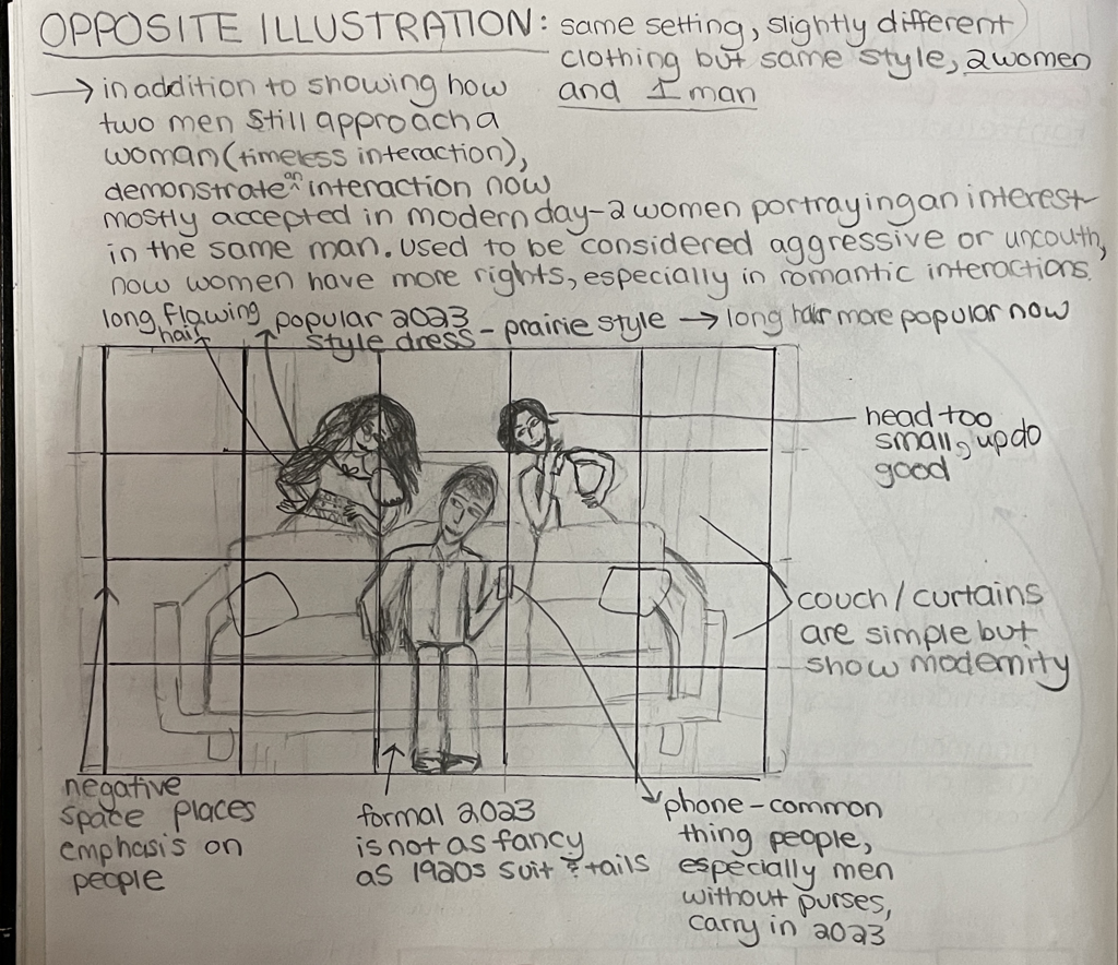
|
On the top, I sketched out my inspiration illustration to better understand the composition and practice drawing the figures. I then analyzed the components of that piece, adding annotations. I utilized my research during this stage, which allowed me to identify traditional Art Deco elements. The notes I took when researching George Barbier and the Art Deco movement are on the right side. I annotated the inspiration by adding notes on the 1920s style objects, clothing, and hairstyles, the symmetry of the men on either side of the woman, and the sleekness of the body positioning. The sleekness was an extremely important element that I knew I wanted to carry over to my pieces. The intention of my illustrations was to modernize the inspiration. I wanted to showcase how romantic interactions have remained the same over a hundred years, while everything else, particularly appearance, has changed. With this in mind, I considered the clothing and hairstyles I regularly observe. The "man bun" and fluffy, tall hair are two popular hairstyles that I chose for the men. I gave them simple, modern dress shirts. The woman has a voluminous, shoulder length hairstyle with layers, and a short form fitting dress. In place of the furry shawl in Barbier's piece, I drew a simple fringed shawl. For the furniture, I drew ordinary fabric curtains that can be found in most people's homes, and a couch from an online reference photo.

My second illustration was required to be the opposite of the first one. I wanted to expand on my original message of timeless romantic interactions by contrasting and showing a situation now accepted in modern day. I decided to do this by depicting two women showing interest in the same man. When George Barbier created his piece in the 1920s, it was unconvential for a woman to show interest in a man who hadn't approached her first. I wanted to demonstrate that in 2023 women approaching men is mostly accepted in society, without the woman being considered "aggressive", "desparate", or "immoral".
I kept the scene the same, with the same modern couch and curtains, as well as the positioning of the bodies. I simply made the two figures behind the couch females and the center figure a man. The clothing style is similar to my first illustration, which is modern semi-formal attire. |

After sketching out my rough idea, I drew both illustrations in a large piece of paper. I outlined the illustration boards on the paper, which I used for the final product, so I knew exactly how much space I had. When drawing the people, I made slight changes to maintain the style of the inspiration. Instead of drawing individual hairs to create a more realistic texture, I drew an outline to capture the general shape of the hairstyle. Also, I outlined thin sections to paint highlights on the woman's dress and the hair of the men. I did this to give the items a shiny effect, one of the characteristics of Art Deco. Lastly, instead of a phone I gave the woman a small purse, to create a difference between the woman and man in the two illustrations.
|

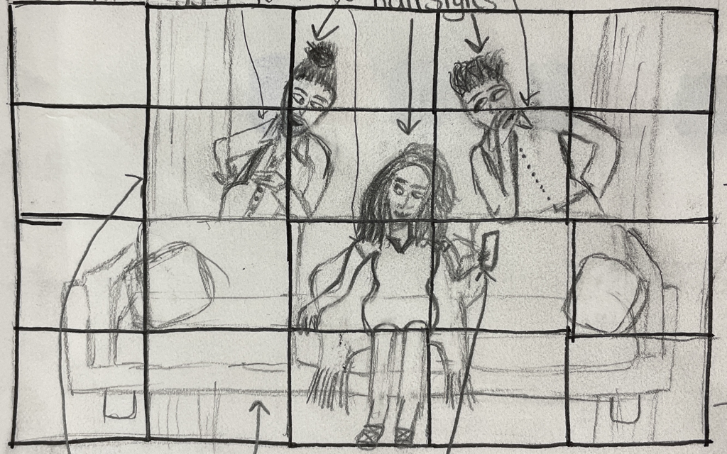
Similar to the first illustration, I outlined the hairstyles instead of drawing realistic hair texture. I did not change the composition in any other way. However, it was extremely difficult to draw accurate proportions for the man on the couch. He ended up looking strange in this planning sketch. I addressed the issue of incorrect proportions at the beginning of my process.
|
process
stage 1 : Transfer
|
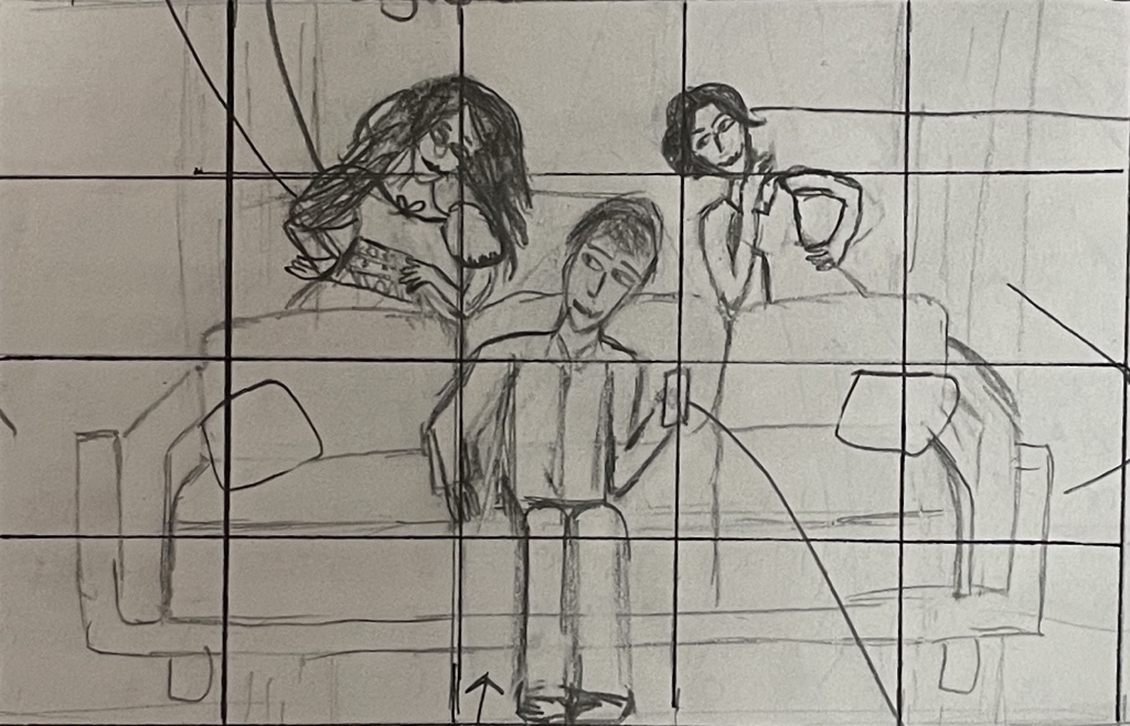
Initially I wasn't going to make a grid, but I realized it would be the best method of drawing after completing my actual size planning sketches. I didn't put a grid on those sketches because the proportions were wrong and I wasn't pleased with the outcome. Although my intial small planning sketches were rough, I felt the proportions were good, so I put a grid on those to transfer the composition to my illustration board. Since the details of this piece are small, and most of the composition consists of larger shapes, I chose to do a five by four grid. I only wanted the grid to guide my proportions, not to focus on the details, so the squares didn't have to be small. I also knew there were aspects of the planning sketches that I wanted to change when drawing on the actual board, such as the location of the curtains. I wanted to avoid making the transfer process extremely tedious, because in past projects I dedicated too much time to making grids. The illustration board is 15 inches by 10 inches, making each square 3 inches by 2 1/2 inches.
|

|

|
By using the proportions of the first sketches, and applying ideas, specifically the hair, from the real size planning sketches, I drew the illustration in pencil on the final boards. I tried to do it lightly but I had to erase some harsher lines so they wouldn't show up through light colored paint.
stage 2 : painting

|
I used three brushes to paint with. The thinnest brush was for smaller areas, such as hair, shiny highlights, shoes, the shawl fringe, the accessories, and the crevices of curtains and couches surrouding the figures. The smaller flat brush was helpful for covering larger areas of the clothing, pillows, and the couches that were too small for the largest brush. This brush was also used to create clean edges, especially when repairing mistakes with white paint. The largest brush could only be used for the couch and curtains and spread the paint in wide areas well.
|

|
I decided to use the same hair color as the woman in my inspiration, to suggest it could be the same woman, depicted 100 years later. Luckily I had almost the exact shade in yellow ochre gouache. Unfortunately, the paint was extremely chunky and difficult to work with. Using water with the gouache helped spread it out more evenly. However, it took multiple layers to achieve a smooth look.
|

|

I used brown directly from the burnt umber tube for both men's hair, and the two women in the reverse illustration. To show the shininess of the hair, similar to Barbier's work, I painted a lighter version of the burnt umber in stripes to show highlights. Originally, as shown in the picture above, I had three stripes, but later I felt this looked unnatural and only kept the two on the left. I had to use a lot of layers to create an opaque look.
|

Painting the couch was one of the most challenging aspects. It took awhile to get the color right, which I wanted to be similar to the tan leather couch reference photo. At first I used too much yellow ochre, so I had to go back over once I had the right shade. In the end I used yellow ochre, burnt sienna, a dot of burnt umber, and white. Initially I was painting with the thin brush I had used for the hair, but then realized it would be much more efficient to use the large brush. The only downside to this was my clumsy hand movements and the messy outcome, which resulted in a lot of refining once the couch was done.
|

When painting the shawl I did not anticipate how the couch would be painted behind the fringe. I should have waited to paint the fringe until the couch was done, but unfortunately I did not think of this ahead of time. I ended up painting over the fringe, causing a dark smear in the area, and then going back over the fringe with more black.
|

One of the benefits of gouache is the variety of ways it can be used. Gouache can be painted without any water, which achieves the most opaque look. Using water, however, helps less paint go farther. Applying water to chunky paint also helps smooth it out. When I mixed the perfect shade, but had a small quantity, such as the skintone above, I applied a lot of water to extend its use. A technique I liked was multiple layers of watered down gouache, although most of the time I applied a small amount of water to smooth the paint, and then painted to achieve an opaque look.
|

As mentioned earlier, the small flat brush was useful when creating clean edges and covering mistakes up using white. There were numerous paint smudges and paint outside of the lines on the boards that created an image of poor craftsmanship. Since there were so many areas to repair, I decided to paint the entire background white for coherence. This required multiple layers, especially over areas of other paint colors. I applied water to stretch the paint longer, but I still ran out of white gouache on the second illustration and used white acrylic paint instead. There did not seem to be much of a difference, and I was able to correct the mistakes for the most part.
|

The oil in the burnt umber gouache shown above had completely separated, creating a weird texture of the paint that I solved by adding water. I also had to remix the oil and the paint. This did not interfere with the final result of the paint, as the burnt umber gouache appeared the same as other colors.
|
color choice

|

|
As I was deciding what colors to use, which I did during the painting process, I tested colors on the large planning sketches. This helped eliminate colors I felt weren't common in 2023 fashion. The hues I chose, along with the fashion in general, is based completely on my own observations, as I did not use any fashion trend research to support my choices. It is simply a reflection of what I notice. On the right, I tried multiple blue and gray hues for the curtains, becuase I wanted them to be simple modern curtains, but not too dark or ominous, as this doesn't align with my overall message.


|
These are the illustrations at the end of the painting stage, along with the corresponding color palettes. For the first illustration, I chose peach and royal blue as the shirt colors. I have noticed a lot of men wearing lighter, pastel hues for dress shirts, oftentimes even colors that used to be associated with femininity, such as baby pink and light peach. Royal blue is another commonly worn dress shirt, more on the traditional side. The woman's dress is pink to emulate the inspriation, which was also done with her hair color. Similarly, I used purple and black as the shawl colors, although they compose a much more simplistic design than the Barbier's illustration.
|

|

|
I tried to create the exact shades of the couch and curtains as the first illustration, but these curtains are slightly darker and the couch is has a little more yellow. I stayed with the idea of men wearing pastels and chose a baby blue for his shirt. For the woman on the right, I illustrated a sleek, sophisticated little black dress. For variety, on the left I painted a flowier, puff sleeved dress that is light green and has a brightly colored geometric waist. This was inspired by the prarie style dress trend and vivid dress colors of 2023.
|
stage 3 : Details

|
I outlined everything and drew the facial features using felt tipped pens. Originally I used the set on the left, which had a variety of tip thickness, but those soon stopped working from drawing over the gouache. I found the black papermate flair pen to work well and used that for the remainder. On the left is the second illustration, outlined, but without the final texture lines.
|

|

Outlining the hands required attention to detail and careful movement. I wanted the hands to look sleek, yet somewhat realistic. Drawing this specific hand was difficult because I needed black paint to be as close to it as possible, without interferring. The pen helped define the borders, which applies to the rest of the illustration too.
|

Outlining the couch was the most difficult part because the pencil lines had completely disappeared. I was able to use my planning sketches as a reference, but I also had to use a ruler to create straight lines. This was time consuming, as I knew making a mistake could only be erasable using paint.
|

When I was touching up mistakes and covering the background in white, I had to go back in after I thought it was complete. I accidentally smudged white onto the border lines, as seen above. This created an additional step, because I had to go back in and reoutline to achieve the crisp finish. The black outline really helped to polish the piece and gave it a complete look.
|

|

|

|

|

|
The above photos show the details I added using the felt tipped pens. These were meant to show texture and movement, emphasizing the positioning of the figures and the hanging fabric of the curtains. I chose to add these to imitate the inspiration. Not only are the figures in Barbier's work lightly outlined in black, but there are texture lines on the woman's dress to show the crease of her sitting and the fabric draped over her legs. The curtains also have lines to show the folds of the fabric. The men's shirts in Barbier's piece have more lines to show the intricacy of the design. I added small lines on the shoulders, elbows and lower backs to create movement in the shirts, in both illustrations. In the second design, I was unable to add lines to the woman's black dress, but it is implied based on the curved lines of her figure.
experimentation

|
Before I started painting, I played with some gouache because I had never used it before and was completely unfamiliar with it. I experimented with mixing red and white, creating different hues. I also tested different amounts of water, and various brushstrokes, such as the long, thin red stroke, and the repetitive, layered pink strokes. I attempted to smooth blend red into the black, which wasn't successful. Additionally, I practiced mixing skin tone and hair color. Lastly, I used black to paint an eye, and then attempted to do that on a smaller scale as I wanted to do in my final piece. This helped me discover that the gouache and my paint brush created too thick of lines, and led me to use felt tip pens instead.
|

|

|

|
One aspect I experimented with a lot was the opacity of the brown hair, which played a signficant role in the uniformity of the pieces. At first I kept the sides of the men's hair a slightly less opaque brown, as an attempt to realistically depict hair. However, I decided later this only looked like poor craftsmanship, so I painted additional layers to achieve an even, opaque color, shown above. When painting the second illustration, I toyed with the idea of the woman on the right having lighter brown hair. I determined this would make her a strange outlier in the otherwise uniform hair color of the figures behind the couches, breaking the unity of the pieces. The picture above shows the second layer of burnt umber I used, applied with less water for higher opacity.

|

|
|
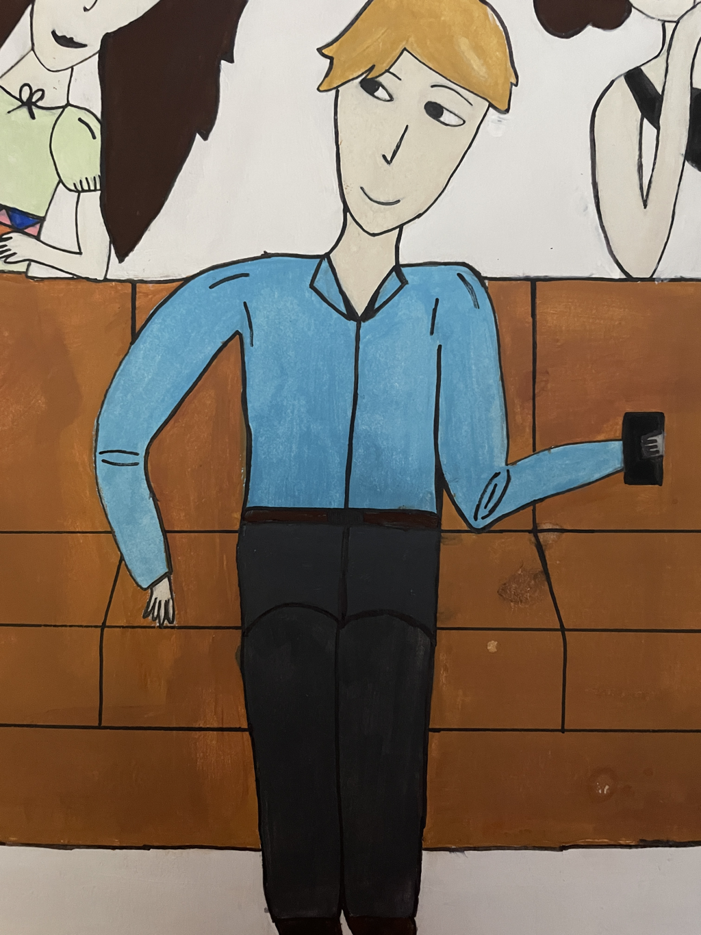
A section that bothered me for the entire process was the shirt length of the man on the couch. He constantly seemed disproportionate, but I could not figure out what parts needed to be altered. Near the end, I finally realized that it didn't make sense for his shirt to go all the way up to his knees. Even in 2023, men tuck in their shirts for a formal or semi formal event. Furthermore, the way it was depicted in the illustration made it seem like his top half was disproportionately longer than his legs. It was difficult to wrap my head around how to change this, so I utilized tracing paper and traced over his body to experiment. By doing this I determined that the section between the fold in the couch, or relatively his waist, and his knees needed to be the same color as the pants. I painted this section a matching charcoal gray, and added a standard, brown leather belt to complete the formal attire.
critique

Falbalas et Fanfreluches by George Barbier
|


Mirrored Centennial Diptych
|
Compare
The most obvious similarity between George Barbier's Falbalas et Fanfreluches and my diptych Mirrored Centennial is the composition, specificially the body positioning. In all three pieces, there is a carefree figure sitting on a couch, looking up to the person on their left. There are also two people standing behind the couch, the figure on the left resting one elbow on the couch and one hand on their hip, and the figure on the right resting a hand on their chin and a hand on their hip. My illustration clearly depicts the same situation as the inspiration, which is two people having romantic interest in the same person. Along with the composition, the balance of my diptych and Barbier's piece is the same. Both have a symmetrical balance, with the emphasis placed on the person in the center, and two people sharing the balance on either side of them. This also correlates with movement, as the eye first finds the central figure and radiates outward to the rest of the piece. There are also similarities in the use of color between the pieces. I used vivid colors, as Barbier did, to imitate the Art Deco style. The hair color of the central figures is the same, and the dress color of Barbier's woman and my woman is close to the same. Additionally, there are highlights on the hair and the woman's dress to create a shiny effect, which can be found on the hair and dress in Barbier's work. Lastly, in both Mirrored Centennial and Falbalas et Fanfreluches the figures and clothing are lightly outlined in black to create defintion, along with lines to show fabric folds.
contrast
The concept behind my illustration was to modernize George Barbier's Falbalas et Fanfreluches. My first illustration is exactly modeled after Falbalas et Fanfreluches, except modernized, but my second piece reversed the situation, depicting two women and a man instead. That being said, the greatest difference is the style of hair, clothes, and furniture of the two pieces. Barbier's piece reflects 1920s hairstyles, with sleek, gelled men's haircuts and a short women's haircut, while my piece demonstrates 2023 hair trends. For the women, this includes chunky shoulder length hair, long hair with layers and face framing, and a voluminous updo with pieces hanging out. For the men, the hairstyles consist of the man bun, tall wavy hair, and floppy hair over the forehead. The fashion is also different, as the men in the Barbier's piece wear tuxedos with vests, and my piece depicts men in modern dress shirts. The use of color here contrasts because Barbier uses black and white for the men's clothing and I use pastel orange, royal blue and baby blue. The style of dress also varies, as well as the accessories. In the inspiration these include a feather fan and monocle, while in my piece they are a phone and a small purse. The last difference is the furniture, which in Mirrored Centennial is a tan leather couch, simple green pillows, and gray blue curtains, but in Falbalas et Fanfreluches is an ornate red couch and pink, silky curtains.
reflection
Intially I was displeased with the outcome of Mirrored Centennial, but after the proess was completely done I realized I am quite proud of it. This diptych can definitely be improved from a technical aspect, particularly the application of gouache. There are several areas of mistakes and messy craftsmanship, and despite trying to repair it, I knew I could never fix all the flaws and create perfection. There is also a difference between the hues of the couches and curtains in the two pieces, and some uneveness in paint layers. Additionally, I do not have a high level of skill when it comes to illustration, so my figures were not as sleek as in Falbalas et Fanfreluches. With that being said, I did well in several aspects, one being working through moments of doubt and completing the artistic process. I also did the best I could depicting the figures as close to the inspiration as possible, and utilizing techniques such as the grid. My patience was tested as I had to apply many layers of paint and carefully outline the figures.
At first I thought I should have done actual fashion trend research to determine clothing, but then I realized there is a stronger personal connection because it is based off my observations and surroundings, which I liked. My greatest success of this piece comes from the concept behind it and the relation it has to the Falbalas et Fanfreluches. I was extremely pleased with the changes I made to modernize it, and how I depicted the same situation, but with a gender switch. Although aesthetically it is not my favorite work to look at, I deeply appreciate the meaning behind it relating to human tendencies towards romantic interactions, and my wish is for the viewer to appreciate the same meaning.
At first I thought I should have done actual fashion trend research to determine clothing, but then I realized there is a stronger personal connection because it is based off my observations and surroundings, which I liked. My greatest success of this piece comes from the concept behind it and the relation it has to the Falbalas et Fanfreluches. I was extremely pleased with the changes I made to modernize it, and how I depicted the same situation, but with a gender switch. Although aesthetically it is not my favorite work to look at, I deeply appreciate the meaning behind it relating to human tendencies towards romantic interactions, and my wish is for the viewer to appreciate the same meaning.
ACT
Clearly explain how you are able to identify the cause effect relationship between your inspiration and its effect on your artwork?
My diptych Mirrored Centennial consists of two people interested in the same person, which is exactly what Falbalas et Fanfreluches depicts.
What is the overall approach the author has regarding the topic of your inspiration?
George Barbier's work was often focused on romantic interactions with an emphasis on fashion.
What kind of generalizations and conclusions have you discovered about people, ideas, culture, etc. while you researched your inspiration?
I concluded that some romantic interactions are timeless, and exist globally, including France, which the origin of the inspiration, and the United States, where I made observations.
What is the central idea or theme around your inspirational research?.
I researched a piece that clearly demonstrates the time period it is from through fashion and depicts human interactions.
What kind of inferences did you make while reading your research?
Societal norms revolving around romantic interactions can develop as society changes and grows more open minded.
bibliography
Donnermeyer, M. (2018, June 13). The Illustrations of George Barbier. Cincinnati Art Museum. Retrieved November 23, 2023, from https://www.cincinnatiartmuseum.org/about/blog/library-blog-6132018/
Iribe, P. (2013, January 14). George Barbier's Falbalas et Fanfreluches – { feuilleton }. { john coulthart }. Retrieved November 23, 2023, from https://www.johncoulthart.com/feuilleton/2013/01/14/george-barbiers-falbalas-et-fanfreluches/
Mellby, J. L. (2010, September 17). Barbier's Falbalas & fanfreluches [Ruffles & Frills] - Graphic Arts. Princeton University. Retrieved November 23, 2023, from https://www.princeton.edu/~graphicarts/2010/09/barbier.html
