
|
choice : Paper weavingOVERVIEWTitle: Habitat Overtaken
Size (cm): Without border - 14.5 x 22 - with border - 22 x 28 Medium: Block print from hand carved linoleum, watercolor on watercolor paper, and cardstock Date of Completion: March 2024 EXHIBITION TEXTHabitat Overtaken is a paper weaving of my block print Habitat Within and an abstract organic watercolor painting I created with a teal cardstock background. The piece was inspired by the paper weavings of Jan Bickerton and Julie VonderVellen. It is meant to demonstrate the complexity of breaking away from societal conformation to stay true to personal preferences. The soft, natural colors of the watercolors are interwoven to contrast with the harshness and uniformity of the cityscape and emphasize my ideal habitat situated in the center.
|
inspiration
jan bickerton

Springtime
|
Jan Bickerton creates paper weavings with a focus on color and texture, which she accomplishes in her piece Springtime by combining multiple colors with a photograph. The image of a table with plates and pitchers is covered with orange, yellow, teal and gray colors. In several areas, there are sections that emphasize two colors interacting with each other. In the top left corner, yellow and orange interact to create a warm tone, which is balanced by the cooler intereaction of yellow and teal in the top right corner. Further down the right side is a vibrant contrast between orange and teal. These color interactions frame the image and placed an empahsis on the tallest pitcher on the table. The pitcher is covered with the mild yellow hue, which really allows the image to come through, but it is still depicted in fragments instead of as a cohesive photo. The lower half of the weaving also utilizes a muted tone, grey, that is woven together with the
|
complex patterened table cloth. I want to use a variety of color overlaying an image similar to Springtime. I view how the viewer can choose to focus either on the colors or on the fragmented photograph. I want to accomplish this with my piece, and allow the viewer to mainly see either the soft watercolor paper or the block print cityscape. This can suggest that the viewer places an importance either more on the rigid unity of a cityscape, or on natural, organic aspects the soft watercolor paper brings.
julie vondervellen

|

|

|
Julie VonDerVellen is a Wisconsin based artist and professor at Carroll University. Her paper weavings are more abstract than Jan Bickerton's, with a focus on soft watercolors contrasting against the ridigty of a solid paper grid. Hand made paper and book pages are materials that frequently appear in her pieces. VonDerVellen conveys significant life moments and their correlating emotions, relationships, and travel experiences. For example, when the former Princeton University Dean of Students retired, VonDerVellen created a paper weaving (above left) containing the the undergraduate rights, rules, and regulations handbook, intertwined with happy retirement wishes from colleagues, to represent her successful career. A lot of VonDerVellen's abstract pieces include borders, such as the middle and right works above, which show a primary image, and with strands are added to alter that image. I did not want to apply this idea to my work becuase I wanted to intertwine two separate images that hold equal weight. However, I did like the smaller size of the paper strips, and planned on utilizing that in my piece to show detail.

|
The use of organic shape in VonDerVellen's work inspired me the most. The shapes are visually appealing without the use of harsh lines and uniformity. They convey a sense of freedom, which I want to incorporate in my piece to demonstrate the freedom of having a home that differs from the norm in society. When creating my watercolor paper, I also want to apply the technique of layering muted tones in a delicate and flowing way.
I particularly like the piece to the left because the viewer's eye is drawn to the center, but the rest of the composition also helps enhance that section. The figure in this weaving stands out among the background, but the surrounding gray squares help create unity within the piece. I want the emphasis in my weaving to be on the center building, my ideal habitat, and have the organic and natural aspects of it enhanced by the watercolor piece woven into the cityscape block print. |
planning
I did not complete any sketches during the planning phase because I felt it would be inefficient and ineffective to spend time drawing a weaving. Instead, I completed a series of tasks to choose the papers in the weaving and practice the weaving technique.

|
First I had to choose which of my nine block print misprints I wanted to use in the weaving. My intention was to use one that had too much ink on it, to show the overwhelming amount of black on the print, and emphasize the uniformity and rigidity of the urban environment. I decided on the middle print in the bottom row. This one has an excess of ink, but not too much that it obstructs all of the details, such as the print above it. I decided against prints that had too little ink, especially the one in the bottom right corner or top right corner. I felt these wouldn't create as strong of a contrast with the organic, abstract watercolor paper.
|
|
Next, I practiced using watercolors, specifically focusing on the vibrancy of the pigment and the way the colors can interact with each other. One of my favorite techniques was using a small amount of pigment of a variety of colors and layering them by blending with water. This can be seen in the center of the practice sheet. For the watercolor painting, I wanted the hues to be soft blues, greens and purples to emphasize the natural, organic and relaxed aspects of my ideal habitat situated in the center of the urban landscape in the block print. My idea was to create a strong contrast between the block print and watercolor, and juxtapose them even further by weaving them together.
|

|

|

|

|

|

|
Once I planned which papers to use, I practiced the weaving technique. First I chose a different block print than the one for the final and removed the white border, and measured 1/8" increments on it horizontally. I chose a scrap of light pink paper and added vertical 1/8" increments, connecting them with a ruler.

|

|

|
Then, I sliced the papers into 1/8" strips of the block print using a paper cutter. At first I connected the increment marks to create lines, as shown on the back of the block print, but I realized this was unnecessary because the wire on the paper cutter can connect the increments in a straight line. I was advised to cut four strips from each paper at a time to prevent the strands from being jumbled up. I cut four strips from the block print and then wove a single strand of the pink paper between them. However, I soon discovered that something needs to secure the beginning corner of the weaving.

|

|

|
I restarted the weaving by securing the first strands of each paper with tape on a flat surface. Then I attached the rest of the four block print strands to the tape, and wove the pink strands over and under them. This started to successfully build a weaving, so I felt confident in beginning the final weaving.
process
the papers:

|

|

|

|
The block print I selected for the weaving is a mostly clear image, but was considered a misprint during the printing process because there is too much ink in some small crevices, and large smudges on the surrounding white border. However, for the paper weaving this is ideal because it overemphasizes the thick black lines and overall harshness that can be found in an unwelcoming urban environment. I cut off the white border to create a feeling of being present in the environment. Then, I made 1/8" horizontal increments on the back of the block print, because this size was successful in the practice weaving. 1/8" squares are also detailed enough for the general image of the cityscape to still be seen after it is woven together with the abstract watercolor painting. It is also mostly consistent with the size of the inspiration pieces.

|

|
To create the final watercolor piece, I traced the size of the block print on the watercolor paper. I started painting two blue circles in the top left and a green circle in the bottom right to create an asymmetrical balance. My habitat is not uniform or conventional, so I felt a symmetrical balance would not be right to emphasize its characteristics. However, it is also not pure chaos, and has an order according to my values, and asymmetrical conveys that. Then I drew free, curvaceous lines from the circles and had them meet in the middle. I utilized the technique I earlier practiced and used little pigment and mostly water to overlap colors.
|
|
I continued adding thin lines to demonstrate nature and freedom within my habitat. I used shades of light blue, green and lilac. On the left I created more of a feathered texture, while on the right I just added the blended colors, smudged slightly. I did not want the strands to be too repetitive or similar. After I was done painting, I compared the two papers side by side, and I was satisfied with the contrast between the two. Although the watercolor does not exactly look like my ideal habitat, the usage of organic shapes/lines and natural aspects are similar.
|

|
weaving:
|
|

|

|
I added the 1/8" increments to the watercolor paper and cut out four strips from each paper. Using the tape, I secured the block print strips and wove a single watercolor strip through it. I continued this process, securing each of the strips onto the tape to form the basis of the weaving.

I found adding the block print strips is easiest by weaving the strip over and under the watercolor strips for the first few, and then picking up the remaining watercolor strips and placing them either over or under the block print strip. Once the block print strip is woven through the vertical watercolor strips, I use my fingers to push it down against the rest of the block print strips. Moving the strip down is shown in the image above, although it depicts the beginning of the weaving, and I did not use the picking up strands strategy until there were more strips and weaving became more complicated.
|

Weaving the vertical watercolor strips between the block print strips is more challenging, as I cannot pick up the block print strands and weave them around the watercolor strip. Instead I have to move the watercolor strip over and under the block print strips, which is more tedious and there is more room for error. Several times I had to undo the weaving due to missing a strand and messing up the pattern.
|

|

|
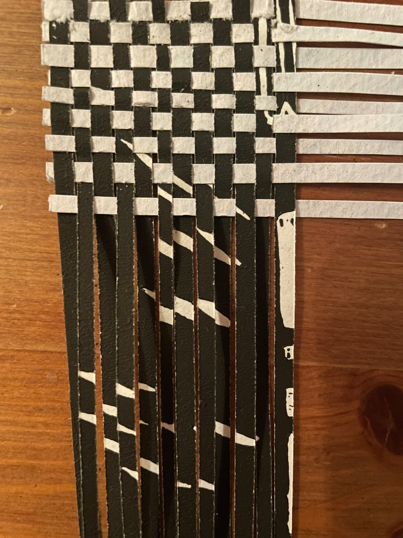
As I continued this weaving process, I encountered a few challenges. Both the block print and watercolor strips are very delicate, and bending them numerous times wears down their stiffness. A few have ripped or almost torn off. I reconnected and supported the strips by wrapping tape around the worn area and then trimming the excess. I also realized that getting the block print papers wet reactivates the ink and causes smudging. This proved to be a challenge when I accidentally dripped water on the strips (top left), and had to blot the ink to clean it up. Also, on both the bottom and side of the weaving, the original strands started to un-weave from the rest of the strips. This caused confusion because I used the edges as a guide for adding new strips and determining if they are supposed to start going over or under. I rewove the strands on either edge, and then secured the tops with tape that I planned to remove at the end.
|
|
At one point, I focused on only weaving the watercolor strands, because they are more difficult to move around the block print strands, and I wanted to weave them before there were more block print strands to work through. When I was close to finishing, as shown on the right, I realized the rest of the watercolor painting would not fit. Due to my inexperience with paper weaving, I did not take into account the amount of space that the papers would take up once they are woven. I ended up eliminating strips and focused on including green in the remaining space. When I got to the top of the weaving with the block print strands, I also did not have enough room to include the whole picture.
|

|

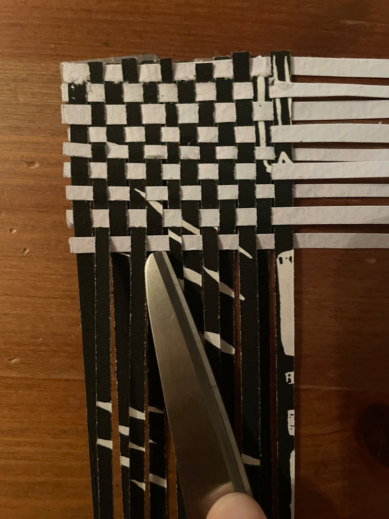
|
However, before I made it to the top I noticed my horizontal strands had started to curve. After examining the weaving, I noticed a lot of strands had been woven at an angle, which affected the newly added strands. Using a toothpick and my fingers, I went back and tried to adjust the vertical strands, which was mostly successful, as I then adjusted the horizontal strands and they became even. However, during the process the strands got worn down due to the movement, and several strands broke. I fixed them by wrapping tape around them for support.
|
finishing:

At this point the weaving was finished because I could not add another full strand at the top. Tape had acquired around the remaining three sides because I needed to secure the weaving while I was working on it.
|

To carefully lift up the weaving, I used a toothpick to remove the tape from the table. I had to go around a few times before it became loose.
|

Next, I flipped the weaving over and taped the edges on the back side with clear tape. I did not add tape anywhere else because it was unnecessary. Since the sides are secured, the middle of the weaving will remain intact. Then, I cut off the tape that had been used to secure the weaving to the table, and carefully peeled it off the front. I also trimmed the edges of paper strands to make them look cleaner.
|

This is the front of the finished weaving. Although the water color paper did not stand out as much as I wanted to, the blue and green pigments can still be seen among the white and black of the block print. There are minor details, such as the taped strands, that are slightly messy, but overall the piece was clean.
|

This is the weaving from the back. On the left there is a large black splotch from when the ink accidentally got wet. Due to the complexity of the weaving, this is not noticeable in the front.
|

Lastly, I added a border around the weaving to give it a finalized look. I decided on this vibrant teal, which further emphasizes the soft blue and green hues of the watercolor paper strands, since they were not as noticeable as I had wanted.
|
experimentation

|
While painting the watercolor piece, I accidentally added too much pigment to the green lines on the right side. This vibrancy was inconsistent with the rest of the soft, muted tones and did not properly emphasize the natural, free organic forms of my ideal habitat in the block print. I found a successful strategy to remedy the green area, which involved adding water to it and then dabbing a small piece of paper towel to absorb the water. As a result, the pigment in the section was decreased, which helped it blend in with the rest of the piece. Additionally, an unanticipated texture was created by the paper towel. This created a slight contrast within the painting, which I liked because it displayed the beautiful imperfections of something natural. This further contrasts against the uniformity of the block print, which shows the boring perfections of something man made.
|
|
Initially I used the paper cutter to cut strips off the watercolor paper, but after a couple the blade started to tear the paper, creating a folded edge. This had to be fixed because non - straight edges create a bumpy and uneven weaving. I decided to draw lines connecting the increment marks, and then use that as a guide to cut the strips using scissors. This led to much cleaner edges and strips that were effective for weaving.
|

|

|
|
|
Another issue I came across was space between the strips. In the photo on the far left, the watercolor strip is not pushed flush against the previous strip. This problem kept occurring and I knew it would result in a loose, messy weaving. I tried using the tip of scissors to push the strips together and create the tightest weaving possible. This closed the gap well, but sometimes that sharpness of the tip created a small indent or tear in the delicate strip. I also tried using finger nails to try and close the gap, which was not as effective as scissors, but did not destroy the strip.
|


|


|


|
When determining the frame around the paper weaving, I experimented with six different colors. I immediately eliminated both the warm and cool black hues, because I felt they supported the harsh lines of the cityscape block print, which is the opposite of what I wanted. I also eliminated the white, because although it looks nice, it blends in with the buildings too much and takes away from the feeling of the natural aspects overtaking the piece. Between the two shades of green and the teal, I decided the teal looked the best because it emphasized both the green and blue hues, while the green hues were lost among the green backgrounds.
critique
first inspiration
|
Springtime by Jan Bickerton
compareSpringtime is a combination of colorful strips and a photo of a table with kitchenware on it. Similarly, Habitat Overtaken is a weaving of colorful strips and an image, which is a city scape. Both paper weavings include images that are the same size woven together, meaning strands were not added to a larger paper. The images hold equal weight. The emphasis is placed in the center of both pieces, on the large pitcher in Springtime and on the organic house in Habitat Overtaken. This creates a circular movement that causes the viewer's eye to travel outwards and observe the surroundings of the object. Also, there are multiple colors used in both of the weavings. Springtime utilizes vibrant orange and yellow, and a muted teal hue. Habitat Overtaken incorporates more muted green and blue hues.
|

Habitat Overtaken
contrastThe use of brightly colored strips is more prevalent in Springtime, while the hues in Habitat Overtaken are softer. This requires the viewer to spend more time studying the piece to notice all of the shades used. The colors in Springtime are utilized as a border to draw attention to the objects in the center, while the colors are evenly spread out in Habitat Overtaken to demonstrate how they stretch across the entire cityscape. This shows how my personal perspective of an ideal home can somewhat cloud my view of my surroundings. While both weavings resulted in small squares of varying images, the technique varies. I wove only two pieces of paper together, while it appears that Bickerton used numerous strips for the different colors and a paper of the photo.
|
second inspiration
|
Untitled by Julie VonDerVellen
compareThe watercolor paper used in Habitat Overtaken is directly inspired by VonDerVellen's work. Although the watercolor is not as obvious as it was intended in my piece, when studied closely the organic shapes and interactions between the soft blue, green and purple hues can be seen. Similarly, in VonDerVellen's weaving there are separate sections of blue and purple, but in the center they interact and flow into each other. The seamless transition between hues is applied in my weaving as well. The size of the strips and intricacy they create are also similar between VonDerVellen's weaving and Habitat Overtaken.
|
Habitat Overtaken
contrastAlthough both pieces are paper weavings, VonDerVellen is known for using homemade paper in her work, while mine is store bought paper that was used with ink and watercolors. The weaving technique also differs between the pieces. There is clearly a primary image in VonDerVellen's image, which is the organic watercolor, and white strips are woven into it. In Habitat Overtaken, there are two images of the same size woven together, not one image with strips added to it. VonDerVellen cut openings in the blue and purple paper, and then wove the white strips into those. I completely cut up two papers into strips, and then wove those strips together. This creates a more immersive feeling, instead of viewing the weaving surrounded by one of the images. I did end up adding a border behind the weaving, but since it is not woven into the other papers, the Habitat Overtaken still has an immersive feeling.
|
reflection
Since this was the first paper weaving I have created, I was immensely proud that I completed the piece and it resembled the vision I had for the final product. However, the process was extremely frustrating at some points, especially when I missed a strand when weaving and it altered the rest of that section, forcing me to redo it. When I was trying to push all of the watercolor strands perfectly vertical to correct the curved horizontal strands, there was one strand in particular that kept tearing. I repeatedly taped it and wove it back through, which was incredibly tedious. I was also disappointed that the edges of the weaving were rounded due to uneven weaving, and I had to cut out parts of both papers because there was not enough room to weave them together. Additionally, I was disappointed that the watercolors did not stand out as much as I had wanted, although I accepted it because it requires the viewer to study the piece for longer, which intrigues them. These challenges led to good takeaways for future paper weavings. I will use more pigment in my watercolors, even if I do want the hues to be muted. I might attempt to use pins and secure the strands to a piece of styrofoam as I am weaving, which will help keep them even more than tape does. I will also research how to include the entirety of an image in a paper weaving. Making the strands larger next time will also probably eliminate the constant tearing of the strands, since the pieces will not be as delicate. Despite these improvements, I find the final weaving visually interesting and intricate. I hope the viewer notices the similarities between the natural house in the center and the watercolors, and questions how the weaving technique changes the meaning.
ACt
Clearly explain how you are able to identify the cause effect relationship between your inspiration and its effect on your artwork?
Both inspirations are paper weavings of two or more pieces, and I combined two papers for my weaving. The organic composition and soft tones of Julie VonDerVellen's work inspired my watercolor piece. Jan Bickerton's combination of colored paper over an image can be seen in the weaving of my cityscape block print and the abstract watercolor painting.
What is the overall approach the author has regarding the topic of your inspiration?
Paper weavings can be purely abstract with a focus on shape and color, or can include photographs and words to convey a more direct meaning.
What kind of generalizations and conclusions have you discovered about people, ideas, culture, etc. while you researched your inspiration?
A paper weaving is an artistic method that can show a close relationship between two things, but can also demonstrate juxtaposition.
What is the central idea or theme around your inspirational research?
Two papers woven together illustrates the intertwined relationship between society and personal preferences or values. Depending on perspective, one can seem to overtake the other, or hold more importance in someone's life.
What kind of inferences did you make while reading your research?
I inferred that abstract color weavings are more open to interpretation and relate to emotion, while a weaving with an image holds a more direct message, but can still be interpretated differently.
bibliography
Bickerton, J. (2024). Jan Bickerton Paper Weaving Art Wall Art. Jan Bickerton. Retrieved March 7, 2024, from https://jmb.pixels.com/collections/paper+weaving+art
VonderDerVellen, J. (2023). Weavings — Julie VonDerVellen. Julie VonDerVellen. Retrieved March 7, 2024, from https://julievondervellen.com/weavings
VonderDerVellen, J. (2023). Weavings — Julie VonDerVellen. Julie VonDerVellen. Retrieved March 7, 2024, from https://julievondervellen.com/weavings
