
Note: The above photo is a screenshot of the piece and created low resolution that does not exist on the actual collage, which cannot be uploaded.
|
Lens based: PhotopeaOVERVIEWTitle: Pieces of Milwaukee
Size (cm): 60.96 x 91.44 Medium: Digital Date of Completion: November 2023 EXHIBITION TEXTThis collage is a compilation of photographs I have taken of my hometown Milwaukee and a variety of people I know. The intention was to experiment with the digital program Photopea and discover tools to use for further projects. I wanted this piece to be amusing to look at, yet have a somewhat eerie and unsettling mood.
|
Process
collage photos (click to enlarge)


To make this collage, I used 10 photos, 5 of people (top row) and 5 of landscapes (bottom row). The first two people are close friends of mine and those photos are from freshmen year. The next two are recent photos of acquaintances from school. The first of the two is looking over the railing on a building roof and the second is dressed for spirit week. The last person is a friend from a different school I met through golf, and is also from my freshmen year. The landscape photos I used are all from the same day when I was walking in downtown Milwaukee. The first three photos are Fiserv forum, the Trade Center, and a Milwaukee mural in the Deer District. The last two photos are abandoned buildings in an area west of Fiserv forum.

I knew I wanted the photo of The Trade building to be my background, so I had to move it to the main collage tab. To do this, I selected the rectangle outline tool on the left hand side, which outlined the whole photo. There were two ways to copy and paste the image to the main piece. One is going to edit, then copy, and then back to edit, and paste on the main page. The other method is simply clicking CTRL + C, and then CTRL + V on the main page. After I first did this, the pasted image was extremely small. I realized I had to adjust the image size, which is shown in the above screenshot. The largest I could make it without cropping the photo is 24 by 32 inches. This was sufficient, because it left a small white border on the top and bottom of the main collage. I ended up liking this look, shown below, more than if the entire background was this photo.

people

|
After selecting the background, I decided I wanted to cut out the main person in the photo to the right and add him to the collage. To do this, I used the quick selection tool, which is found under the rectangle outline tool. I clicked on the person and the tool outlined him and whatever else the tool recognized as being part of him. As seen to the left, the outline is not completely accurate, and included several sections of the background.
|

To eliminate the excess background of the outline, I went to the top of the screen and clicked refine edge. This tool, shown above, allows the user to select a different color and then apply it to the image. Black is what I used, because when dragged across a part of the image on the left, it eliminates that in the new image on the right. This was a somewhat tedious process because there were thin areas of background I needed to eliminate. The refine edge tool has an option to zoom in or out, and increase or decrease the size of the brush. In the screenshot below, I am using a size four brush to clear the thin area between his legs. The background of the new image is set on transparent because the goal is to isolate the main figure.


|
Once I was satisfied with the image, I went to select, then all, and then copied and pasted the person without the background onto the main collage. I used the move tool at the top of the left hand tool bar to drag him on top of the central light post, which I thought was visually interesting. By left clicking on layer 2, which is the person, and I had an option to duplicate the layer. This was essentially like copying and pasting, which I was not able to do because the image was now a layer on a collage, not a separate image as before. After duplicating, I had two figures of the same size. However, I wanted a larger one to go on the right. To do this, I had to go back to the original image, change the image size (under the image heading) and copy and paste that version.
|

|
I was completely unfamiliar with the clone tool, which I used in the next photo, and it required extra practice that is detailed in the experimentation section. I wanted to keep the background, because I felt the bus setting fit well with the image of my friend. With this tool I drew a section of the image on top of the already existing one, creating two side by side versions. Then I increased the size of the image, and copied and pasted it on the side of The Trade building in the collage.
|

|

|

|
Next, I used quick select to isolate the figure in this photo from the background, and then repeated the earlier steps to refine the background. To add to the unsettling mood of the piece, I rotated the photo using the flip vertically tool, housed under image, then transform. Lastly I selected, copied and pasted the image onto the collage, on the right above some trees.
|

I discovered the patch tool during this process, located on the left tool bar. With this tool, I could outline a section of the photo, which then removed it. In the hole this created, the same photo was shown, and could be moved to show a certain section through the hole. Using the patch I removed a section of the phone and then moved the photo to show the top of the head and phone, creating a double image.
|

Then I played with the color balance of the image, first setting the range to shadows, which brought out the darkest values of the photo. Then I increased the cyan (red) balance, giving the photo a deep, eerie red hue.
|

I kept the image's size, and after copying and pasting I duplicated it three times, creating a 2 x 2 grid of red images. I tried cropping the top off, but for some reason it wouldn't work, and I realized I liked it better this way because the overlap onto the white border added a focal point.
|

|

|

|
For the next and final image of a person, I again used the quick select tool and then refine edge to eliminate the background. I also decided to eliminate the lower half of his body. I increased the size of the image because I wanted the subject to be one of the biggest elements on the collage, and to appear as though he's watching over the city. It was pasted on the left side and the person is looking directly onto the road. After doing this, I adjusted the brightness/contrast, at first lowering it to create an ominous shadow of a person, but then brightening it to look like a significant figure protecting the city.
landscapes

|
The first landscape photo I wanted to add was of the Fiserv Forum in downtown Milwaukee. For the landscapes, I wanted to focus on altering the photo, but keeping the entire composition instead of eliminating background. The first tool I used was the blur tool, found under the drop icon on the left. I increased the brush size in the left hand corner, and changed the blur strength to 92%. After dragging the brush over the image, it blurred it, and I copied and pasted the photo next to the pink figure in the back. My idea was to take three varying landscapes and put one next to each pink figure, to show how the same person could experience several different environments all in Milwaukee.
|

|

|
I used the sponge tool for the second photo of a mural in Milwaukee. Similar to the blur tool, I had a brush size that I increased and used to create the effect. I selected saturate as the mode, which then brought out all the colors, creating neon hues. I increased this image size and pasted it below the figure on the left. I then utilized the opacity option above the list of layers. I lowered the opacity to 36%, creating a double exposure which blended this image into the background.

|

|
After the above step I realized I had to rearrange some of the photos, moving them to the front so they could stand out more. I did this by simply dragging the layer until it was above the layer of the photo I wanted behind it. I dragged the layer of the overlooking figure above the layer of the mural, so the mural image could fade further into the background. I did this with several other images to achieve the look I wanted.
|
The last landscape image I altered with the strange dodge tool. This tool also involved a brush, and created thin gray outlines of the image on top of it. When I copied and pasted it, the image appeared on my collage with a gray background and lighter gray outlines of the image. It was difficult to tell what the image had once been, so I placed the original image behind it to suggest the form.
|

|

|

|
|
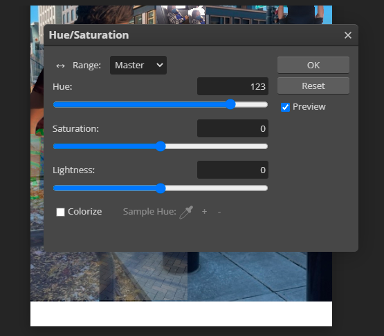
For the last landscape photo, I tested out the curve tool, found under the image tab, then under the transform tab. Having no idea how this tool worked, I simply moved the dot and changed the curve on the graph. This created a strong contrast and severely darkened the image, which contributed to my unsettling mood. I moved this image next to one of the pink figures, similar to what I had done with the other two landscapes. Then I duplicated the layer, adding the second one beneath this one and to the side. I used the hue/saturation tool to give it a greenish tint, creating additional contrast between the two copies.
experimentation

|
I found the clone tool by looking at the various icons on the left side tool bar. Since I had no previous knowledge of this tool, I had to determine what it did, and then decide how to use it for the collage. With the clone tool, I had to click on the image I wanted to replicate, which is the girl on the bus. Then my cursor was replaced with a circular brush, and I dragged it over the screen to see what would happen. I discovered it drew the image I had previously clicked on, wherever I was using the brush. My practice can be seen in the screenshot on the left. After this, I deleted my work by using the keys CTRL + Z, and then created my final image as seen in the process section.
|

|

|
Once I placed the finalized image on the collage, I had a vision of slanting the photo to match the perspective of the building. I looked for a tool that could do this, and discovered the perspective tool under the crop tool options. It appeared to be simple, and I dragged my cursor to outline the photo. I was successful, as next I was able to adjust the corners, changing the perspective. However, when I went to save the changes, my entire collage disappeared. I undid the action and tried it again, with the same results. I retried for the final time on a separate occasion, and the message "Not enough RAM" popped up on the screen, which is shown above on the right. I finally accepted I would not be able to use this tool, and left the photo on the side of the building with its original perspective.

|
When I had finished creating my collage, there was something bothering me, and I realized this photo would look better in the negative space of the sky in the top right corner. I used the move tool to drag it there, but I still wanted the figure's feet to be visible, so I arranged the layers to move this photo to the back. I also lowered the opacity to blend the photo into the surrouding sky.
|
reflection
Prior to this collage project, I had limited experience with photoshop, but this was a successful reintroduction and expansion on digital art for me. I was able to find and correctly use multiple tools that will be helpful to know in the future, which was the intention of this project. Working with Photopea did come with a series of challenges, most of which I overcame. The biggest one was my chromebook crashing when I tried to work on the website, making it impossible to make progress. I found that using a windows computer worked better with the program. Unfortunately, there were a few difficulties I could not solve, such as being able to use the perspective and crop tools after pasting an image onto the main collage. I came to the conclusion that some tools must be applied before the image is pasted onto the collage, which is useful information for furture digital work. Although I did not have an artistic inspiration or deep meaning behind this piece, as it was focused on process, I did enjoy seeing various photos of my hometown come together. The final piece could have looked more aesthetically pleasing, but this was not the goal, and I am still satisfied when looking at it because it demonstrates a variety of editing strategies.
