
|
UWM reliefOVERVIEWTitle: Cyclical
Size (cm): Circle: 30.48 x 30.48 x 10.16 Gear: 25.4 x 25.4 x 15.24 Receptacle: 33.02 x 30.48 x 12.7 Medium: Cardboard, hot glue and electrical tape Date of Completion: February 2024 EXHIBITION TEXTCyclical is a cardboard wall relief containing three separate components: a circle, a gear with delicate, intertwined strands, and a floor receptacle. Hot glue and black electrical tape were used as adhesives. Inspired by Lee Bontecou's abstract sculptural works Untitled 1967, Untitled 1993, and Nostromo, Cyclical is meant to display common human feelings of exposure and vulnerability. The composition of the piece focuses on the elements of shape and texture, and the principle of contrast.
|
INSPIRATION
lee bontecouLee Bontecou's Untitled 1967 is a sculptural piece constructed from vacuum-formed plastic, plastic tubing, and frosted acrylic. The material is partially sheer and allows light to flow through it, creating a delicate and elegant effect. The weight of the plastic also appears to be light, with bunches of thin strands flowing down from the largest flower at the top. Despite the beauty and lightness depicted, Bontecou was influenced by dark and destructive events. She witnessed from afar the effect of World War II, the Korean War, and the Vietnam War, as well as the constant threat of further destruction during the 20th century. This accounts for the foreboding and ominous feel her work provides, which makes the viewer wonder if there is more depth to the piece. This can be seen in the darkness created by the layers of plastic petals within the flower, which contrast with the rest of the piece. My first reaction was an appreciation of the beautiful natural elements of the piece. Later, I began to question the meaning behind the piece when looking beyond the visual aesthetics. I hope to create this same feeling of delicacy with a darker meaning for my cardboard relief.
|

Untitled 1967
|

Untitled 1993
|
Similar to Untitled 1967, Untitled 1993 is an abstract sculptural piece with a base, but was crafted with welded steel, porcelain, and wire. When looking at this piece, I am immediately drawn to the dark, circular voids in the center of both forms that contrast with the lightness of the rest of the piece. The black hole is an element that appears across her work, and is meant to allude to sexual or industrial metaphors. The inside of her pieces are completely black, which represents secrets individuals hold as well as an oblivious outlook on the cosmic universe. Instead of plastic strands hanging from the piece, there are thin wire strands that create circular movement around the forms, which add to the delicacy of the piece and contrast with the darkness within. Similar to Untitled 1967, the piece has an elegant appearance but an ominous meaning.
|
|
Nostromo, unlike the other works, is a hanging piece suspended by a delicate string. There is a protective shell on one side of the sculpture that looks like a boat sail pushed by the wind. On the left side there is a ball atop a short, delicate pole placed in the center of a long, thin, line extending from the piece. The feeling of enclosure around the dark, encased center creates a contrast with the completely open section on the left, and creates a feeling of exposure and vulnerability, two key concepts I want to portray in my cardboard piece. The viewer's eye is immediately drawn to the bold, curved center, forcing them to take more time to notice the delicate components of the piece. My intention is to distract the viewer with bold, chunky elements that may be displeasing to the eye, and force them to take time to find and appreciate the more intricate and beautiful aspects that are less obvious.
|

Nostromo
|
PLANNING

|
Initially, I drew three thumbnail sketches of potential relief ideas. Each piece conveys feelings of exposure and vulnerability, but utilizes different artistic elements and principles of design. The sketch in the top left corner focuses on the use of line and space to create emphasis. This is shown by the large arch with the thin line leading to a rounded form surrounded by negative space. The dangling element is meant to show vulnerability by being isolated, but I did not feel extremely passionate about this idea. The second sketch utilized shape and texture to create contrast. The simple, round circle contrasts with the gear, and both of these geometric shapes contrast with the organic strands of broken cardboard material flowing from the center of the gear. The receptacle-like shape on the ground receives the flowing strands, and a small strand escapes through the bottom, which is hollow. This concept also utilizes space as it is composed of three separate components set up near each other. My final idea was initially my favorite, but was far too ambitious for my skill level and was not a practical size to transport on a bus.
|
This concept focuses on balance and contrast created by texture and space. In the center, there is a collection of smooth cardboard strips delicately intertwined atop a box. There is a protective shell behind this, which was directly inspired by Bontecue's Nostromo piece. The back is composed of layered cardboard squares, and it is surrounded by accordion folded thin cardboard paper. The contrast between the rough, confusing and overbearing shell and the beautiful, delicate center demonstrates the exposure of the internal.

After finalizing my idea, I drew another sketch comparing my piece to the Lee Bontecue pieces it was inspired by. I annotated aspects of each piece that can be seen in my work.
|

Lastly, I drew the relief from the top, side and front views, including the measurements (in inches). I also drew how the gear is assembled, with two flat gear shapes, one with a hole cutout in the center, and a tube connecting the two. This was extremely helpful when building the relief, for visualization and measuring the cardboard.
|
Process
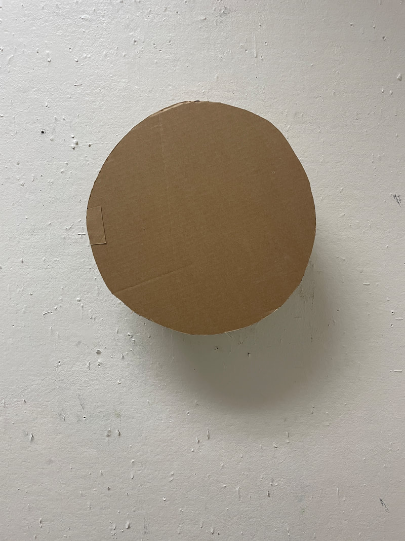
the circle

I knew I wanted the circle to have a 12" diameter, so I used the length of a ruler to measure it.
|

Since I did not have a large enough compass or circle making device, I put two marks on either end of the ruler, while keeping it in the same place by holding down the center. I rotated the ruler and repeated until I had a circle of dots. I connected the dots by drawing lightly with a pencil.
|

I used an exacto knife to cut out the circle. It was not perfectly round, which I wanted it to be in order to create a contrast between rigidly geometric shapes and organic shapes. However, it was fairly close to being perfect, and to ensure both sides of the circle were the same, I used the first circle to trace the second one.
|

To connect the two circles and create a 3D form, I needed a rectangle to wrap in between them. I knew I wanted the circle to be 4" thick, but I made a mistake by estimating how long the rectangle should be, instead of calculating it. I used an exacto knife to cut this out as well.
|

Since my intial experimentation with rounding a piece of cardboard, I learned that folding is ineffective and does not create a refined look. I was advised to use an exacto knife and create lots of slices across the rectangle, but not cut all the way through. This allows the rectangle to bend easily into a circle.
|

Unfortunately, since I only estimated the length the rectangle should be, I ended up needing it to be longer, and had to repeat the process and attach it to the rest with hot glue.
|

As can be seen in the photo, the rectangle did not turn out to fold in a perfectly round circle, which is acceptable because the viewer cannot tell when looking at the front of the piece.
|

When it came to attaching the circles to the rounded rectangle, I knew they had to line up with each other, otherwise the effect of having a perfect circle would be ruined. I centered the rounded rectangle on one of the circles, securing the sides with black electrical tape. Then, I flipped it over, and applied hot glue to the top of the rounded rectangle. I secured the other circle on top of it, aligning it with the circle taped to the bottom. Then, I flipped the circle over and removed the taped side, applied hot glue to the rounded rectangle edge, and pressed the circle on, ensuring it matched the one on the bottom.
|

The center of the circle was still not perfectly aligned with both sides, but I experimented with the direction it can hang, and if a certain side is facing the floor the viewer will still observe a plain, sturdy, standard circle.
|

|
Lastly, I used an exacto knife to carve out a small hole in the back, large enough for a nail to fit, so the circle can be hung on the wall.
|
|
the gear

At first I tried to create the gear shape by drawing it free hand, but this proved to be difficult and did not result in the right shape.
|

To make an even gear, I used the same ruler method and drew a circle with a 10" diameter. There are 11 notches in the gear, so I experimented with different lengths around the circle to find how big each notch should be. I found that each notch should be 2" wide with about a half inch inbetween them. I wasn't able to make every notch exactly 2", but they are all close to the same size with the same distance inbetween them.
|

Then, I drew the lines for each notch, leading them down at a slight angle. I did not measure a specific angle; I tried to make them even using visualization.
|

Once I was satisfied with the notch lines, which were all 2" long, I connected them in an inner circle.
|

Then I erased the outer circle, except for the tops of the notches, to finalize the gear shape.
|

To cut out the gear I had to use a box cutter because the cardboard was too thick for an exacto knife. I inserted the box cutter, then retracted it, then inserted it in the next space, and repeated all the way around to cut it out.
|

Once I cut out the outline of the gear, I detached it from the rest of the cardboard. During this step I realized I hadn't cut every section completely through.
|

The gear had rough edges and bits of cardboard hanging off it. I was not pleased with this outcome because it had a very unpolished look.
|

To clean up the edges, I used sandpaper to wear down the cardboard. This strategy was mostly successful, but since I am inexperienced wtih using sandpaper, I wore down a couple areas too much and created corners instead of clean and sharp edges.
|

To ensure symmetry between the gears on the front and back of the form, I traced the first gear to create the second one. I cut it out using the same method with the box cutter, and cleaning off the edges with sandpaper.

Next, I had to form the tube that connects the two gears and creates a dark hole for the delicate strands to emerge from. I used the same strategy of cutting out a rectangle to bend and form a cylindrical shape. This time, to ensure the rectangle is the perfect size for the gear, I used a formula to find the circumference of the circular opening, which is how long the rectangle has to be.
|

Once the gears were done, I had to create a circular hole in one of them for the tube. I used the ruler and made points 6" apart to create a circular with a 6" diameter.

Once I had the rectangle, I made perferations across it and was able to bend it into a round form.
|

I cut out the circle using the box cutter and smoothed it using sandpaper. Similar to the circular form, this was not a perfect circle, but was extremely close.

I learned earlier that hot gluing the two edges of a rounded form together is ineffective because it creates a harsh edge and often does not stick. Instead, I used two smaller rectangles to connect the sides.
|

I made perferations on the small rectangles as well, so they could bend with the rest of the rounded form. I glued them on one side of the rectangle, then bended the other side around and secured it.
|

The tube fit perfectly in the gear, and did not hae to be secured with glue. The effect of an ominous and dark void similar to Bontecou's work was achieved. I glued the other gear on the back, and carved two holes for nails, to allow the piece to hang on the wall.
|
the receptacle

I wanted the floor receptacle to be roughly the same size as the circle to create a balance around the gear. I sketched the outline of the receptacle to be about 13" wide at the widest point, and 12" tall. Then, I cut it out using a box cutter, and smoothed the edges with sandpaper.
|

I traced the first half of the receptacle and repeated the cutting and sanding process to produce an identical second half.
|

The sides of the receptacle needed to fold and bend to fit its curvaceous form. I utilized the same technique as earlier and cut rectangles, and then sliced thin lines along them to create folds. The rectangles were 5" wide, making the receptacle 5" wide.
|

Once the side rectangles were finished, I created six small rectangular tabs and sliced them so they could bend. I folded them in half and applied hot glue to both sides to connect the side to the front and back receptacle halves.
|

This technique was extremely successful in creating clean edges and securing all the components of the receptacle.
|

The rectangular tabs added an unanticipated downwards movement to the piece, suggesting even further that the organic and unique expression (the strands) is sucked into it and disappears from the world.
|

|
The finished receptacle was extremely polished and resembled the sketch once placed on the floor.
|
the strands

The strands created most of the contrast in the piece, in both shape and texture, due to its organic form and combination of rough, grainy, and extremely smooth components. To create them, I collected thin cardboard that was torn off a larger piece and contained strings. I also ripped the cardboard paper layer off a piece and shredded it to create a variety of unique, strange shapes. To add to the contrast, I used pieces of black electrical tape as adhesive, which greatly stands out and helps bring emphasis to the center of the gear and the strings.
|

I wanted the focus of the piece to be on the strands emerging from the gear, and to appear as if they were contained but burst out. The intention was for this to create a contrast with the solid and completely sealed off circle to the right, slightly above the gear, showing its superiority to the complex, organic and somewhat messy strands. Once the strands were complete, I secured them on the inside of the gear.
|

To suggest that the receptacle was not successful at containing the organic expression, I created a shorter strand to tuck underneath the receptacle, as if it escaped from the oppression.
|
|
When hanging the pieces in the UWM gallery, I arranged the circle on the right, higher above all the other elements, and the gear to the left and slightly below it. I placed the receptacle directly below the strands emerging from the center of the gear. Underneath the receptacle there is a smaller strand on the right side that escaped. In front of the receptacle I placed the circle that I cut out to create the hollow tube in the gear. This is meant to suggest that the strands were so powerful that they burst through the gear, forcing an opening, only to be received and pushed back into the ground by the receptacle.
|

|
Experimentation
|
I knew one challenging aspect would be creating rounded forms with the stiff cardboard. For my first experimentation, I used thick white cardboard and bent it, attempting to break every stiff edge. This resulted in a rounded shape, although there were still some flat sections, and the folds resulted in the cardboard looking worn down.
|

|

|

|
Once it was suggested that I should create perferations to round a form, I had to experiment with how to create those. I tested different depths and the distances between perferations. I found that perferations that go almost completely through the cardboard are not ideal because they create a sharper fold when the piece of rounded. I also discovered that perferations shouldn't be more than half an inch apart because it creates a jagged look instead of a seamless circle. Therefore, the best perferations are about a quarter inch apart and the depth is halfway through the cardboard.
|
|
Another area of experimentation occurred when creating the diameter of the hole in the gear. I didn't want it to be so wide that the center of the gear was entirely a void, but I also wanted a large enough opening for the strands to emerge from. My intention was to create an ominous, and partially unsettling, dark void for the viewer to look at, and force them to question what the strands that were coming out of the void could represent. In the photo on the right, I experimented with two different diameters, 6" and 8". By plotting points for each of them, I was able to visualize the two different potential voids. I determined that the 6" diameter was best to achieve a secretive and mysterious mood.
|

|
critique
first inspiration
|
Untitled 1967 by Lee Bontecue
CompareThe inspiration Untitled 1967 relates to Cyclical mostly in the meaning, but also the usage of shape. The intention of Lee Bontecou was to create a sculptural piece that depicts lightness and beauty, but has a darker meaning that juxtaposes with the visual aesthetics. While my piece is not as ethereal as Untitled 1967, it does have a more sinister meaning than just simply being shapes existing in the same space. The organic shapes, especially of the thin, hanging strands, are similar to the hanging strands in Cyclical. The emphasis is also placed on the spot where the strands come down from the overlapping petals of the flower, similar to the way the strands originate from the gear in my piece.
second inspiration
Untitled 1993 by Lee Bontecue
COMPAREThe most significant similarity between Untitled 1993 and Cyclical is the usage of a dark void. In Untitled 1993, there are two dark voids in each form. They are circular and create an ominous mood, while evoking curiosity in the viewer. This was applied to Cyclical and can be seen in the center of the gear, where a hole was cut out, revealing the long, dark tube connecting the two halves of the gear. The contrast utilized in Untitled 1993 can also be seen in Cyclical. The two tall, large and solid forms in the center contrast with the array of thin and delicate lines jutting out and circling them. Similarly, the large, geometric shapes of the gear and the circle contrast with the organically woven strands of cardboard bits.
third inspiration
Nostromo by Lee Bontecue
COMPAREThe main connection between Cyclical and Nostromo is the existence of a shell-like component surrounding a more delicate feature. This was essential in delivering a feeling of exposure and vulnerability. The taut sail in Nostromo closes in around a thin, frail looking pole that sticks out from the center. In Cyclical, this is similar to the long, dark tube of the gear that surrounds the fragile and delicately connected strands. The contrast between sturdy and solid and exposed and weak is apparent in both pieces. In Nostromo, the strong, solid sail contrasts with the strings and small circles descending from it, as well as the string it hangs from. In Cyclical, the solidness of the circle and the gear, as well as the receptacle on the ground, forces the exposed strands to stand out.
|
Cyclical
COntrastThe most obvious differences between Cyclical and Untitled 1967 include the medium and the size. Untitled 1967 is made from vacuum-formed plastic, plastic tubing, and frosted acrylic, which allows light to travel through it. On the other hand, Cyclical was constructed from cardboard, and creates darkness, especially in the void in the center of the gear. Untitled 1967 is also a smaller piece that can be placed on a table, while Cyclical consists of three separate parts that are set up low against a wall. Lastly, Untitled 1967 lacks geometric shape, which is utilized in Cyclical to create contrast.
Cyclical
COntrastSimilar to Untitled 1967, the main difference between Cyclical and Untitled 1993 is the medium, size, and way it is presented. Untitled 1993 is also smaller than Cyclical and is set up on a tray, while Cyclical is a wall relief. Untitled 1993 is composed of welded steel, porcelain, and wire, which is strikingly different from the mundane, brown cardboard of Cyclical. Additionally, no geometric shapes were utilized, unlike the rigid gear and circle in Cyclical.
Cyclical
COntrastThe contrast, while similar in both pieces, is expressed slightly differently. While the sail in Nostromo appears sturdy, it is still an organic shape, while the sturdy elements in Cyclical are rigidly geometric. Additionally, the material and presentation method differ. Nostromo is hung from the ceiling, and was not constructed with cardboard. The use of space also differs, as in Nostromo the contrasting elements are separated by negative space to produce the feeling of exposure, while in Cyclical there is no space in between the strands and the gear, as the strands come directly out of the gear.
|
reflection
The result of this project was extremely pleasing as this is the first time the end product was nearly identical to the planning sketches and mental vision. While there were some minor differences, such as imperfect circles and obvious seams, the components were created as intended. I did realize the difficulty in making the cardboard look finished, especially since I did not paper mache the pieces or add polish. When working with cardboard in the future, I plan to attempt these techniques and consider how Cyclical could look different with those finishings applied to it. I took away several techniques that I found successful when manipulating the cardboard, the most significant one being the perforations. The curved cardboard elements appear refined due to the cut lines on the inside that allow it to fold. When people view Cyclical, I hope they are intrigued by it and a strong feeling of curiosity is evoked within them. The intention is for the viewer to have their own interpretation, shaped by their perspectives and experiences. This piece has inspired me to further explore the creation of abstract art through experimenting with other materials. I also plan on exploring the use of cardboard in future projects.
ACT
Clearly explain how you are able to identify the cause effect relationship between your inspiration and its effect on your artwork?
The darkened hole in the center of the gear, which contains delicate hanging strands and a surrounding protective shell, are aspects that can be seen in Lee Bontecou's work. Bontecou also included ominous, dark holes and chunky protective shapes surrounding delicate elements in her pieces.
What is the overall approach the author has regarding the topic of your inspiration?
A sculptural piece might appear ethereal or delicate but some elements allude to a deeper and darker concept.
What kind of generalizations and conclusions have you discovered about people, ideas, culture, etc. while you researched your inspiration?
Large scale conflicts, such as war, and especially World War II, influence people globally even if they were not directly physically attacked.
What is the central idea or theme around your inspirational research?
Exposure and vulnerability can be seen through the contrast of a sturdy and protective element surrounding a fragile and delicate one.
What kind of inferences did you make while reading your research?
I inferred that the events during Lee Bontecou's life that influenced her artwork are specifically seen in the three inspiration pieces.
bibliography
Buhmann, S. (2007, May). Lee Bontecou: Vacuum-formed Sculptures and Related Drawings. The Brooklyn Rail. Retrieved February 15, 2024, from https://brooklynrail.org/2007/05/artseen/lee-bontecou-vacuum-formed-
Butterfield-Rosen, E. (2007, April 28). Lee Bontecou – Artforum. Artforum. Retrieved February 15, 2024, from https://www.artforum.com/events/lee-bontecou-3-183642/
Chattopadhyay, C. (2004, March 1). The Uncanny Eye: Lee Bontecou - Sculpture. Sculpture Magazine. Retrieved February 15, 2024, from https://sculpturemagazine.art/the-uncanny-eye-lee-bontecou/
Romanov Grave. (2011, December 4). Lee Bontecou’s Nostromo. Romanov Grave. Retrieved February 15, 2024, from https://www.romanovgrave.com/reviews/lee-bontecous-nostromo
